
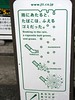
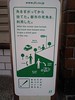
简洁之美!最近发现很多线条风格的设计,招贴,我第一次看见日本烟草产业的广告时就被这种单线魅力所吸引, 寄腾文平,网站 最近才知道他的名字,而且现在很时髦的免费杂志R25的插图全由他制作.R25是针对25岁年龄层的免费杂志.同时也有针对25岁女性的L25,每次出来都被一抢而空.
回到寄腾文平给日本烟草做得各种招贴,简洁的美,环境保护的绿色,以及带有告示性的风格.都和JT(日本烟草)宣传环保的主题相吻合,很到位.下面是图.


看图都能明白意思了.不用解释了.大图发现线条拐角的地方,看似方角的地方其实都是圆角.
下面是几张实图,嘿嘿.Flickr好用.


I drop a leave a response when I especially enjoy a article
on a site or if I have something to valuable to
contribute to the conversation. Usually it’s a result of the sincerness displayed in the article I browsed. And on this post 招贴设计 – 简洁的线条风格 – 日本设计,网站设计,设计案例分析,用户体验. I was moved enough to drop a commenta response 😉 I do have some questions for you if it’s allright.
Is it only me or do a few of the responses come across as if they are left by brain dead visitors?
😛 And, if you are posting on other online social sites, I’d like to keep up with you. Could you make a list the complete urls of all your public pages like your twitter feed, Facebook page or linkedin profile?